Tableau Visualization
Using chart types to emphasize different aspects of data
Dataset: The Bank of Canada Commodity Price Index (“BCPI”) from 1972 to 2021, monthly
(Source: https://www.bankofcanada.ca/valet/observations/group/BCPI_MONTHLY/csv?start_date=1972-01-01, retrieved on Nov 19 2021)
First, let’s have an overview with a simple line chart.
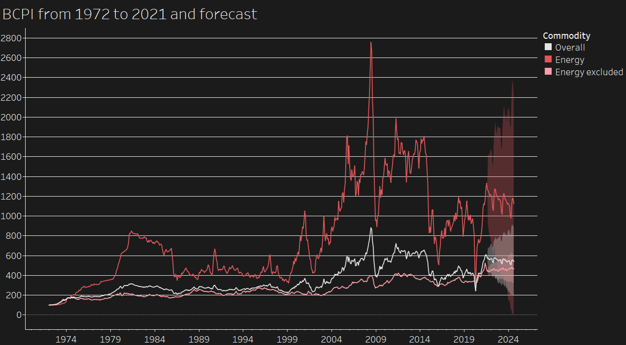 The energy BCPI is the dominant influence on the overall BCPI, as the overall BCPI trend mirrors closer to the energy BCPI than the index with energy excluded.
Let’s say I’m interested to see how the energy BCPI rises and falls over the years. A bar chart showing the differences between years will do the job. The index line chart is overlaid to give context to the differences.
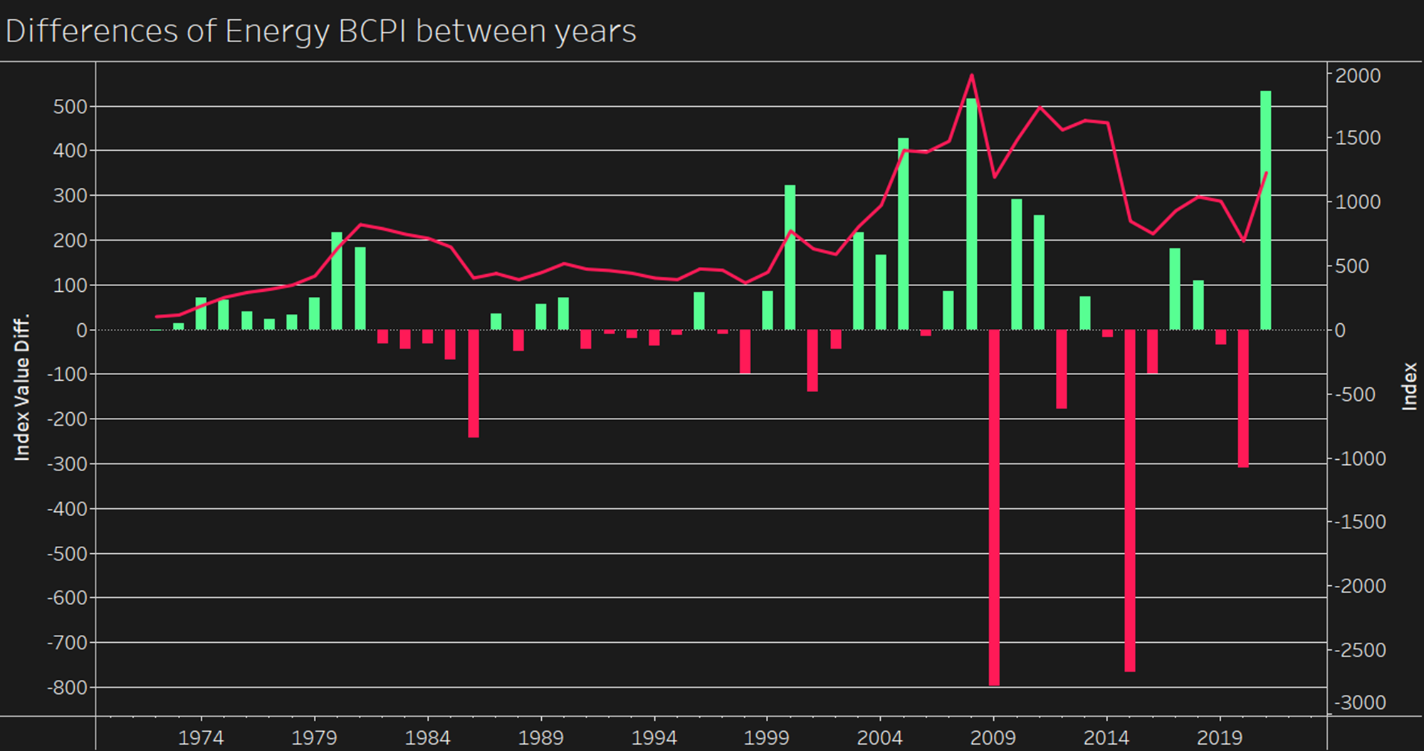 We can see that it plunged dramatically twice, in 2009 and 2015. Analysts can use this information for further research. The chart also shows the index can drop more dramatically than it can rise. Note that index values are aggregated from month to year level to avoid showing too many bars.
While a waterfall chart would be better at highlighting the cumulative effect of changes over the years.
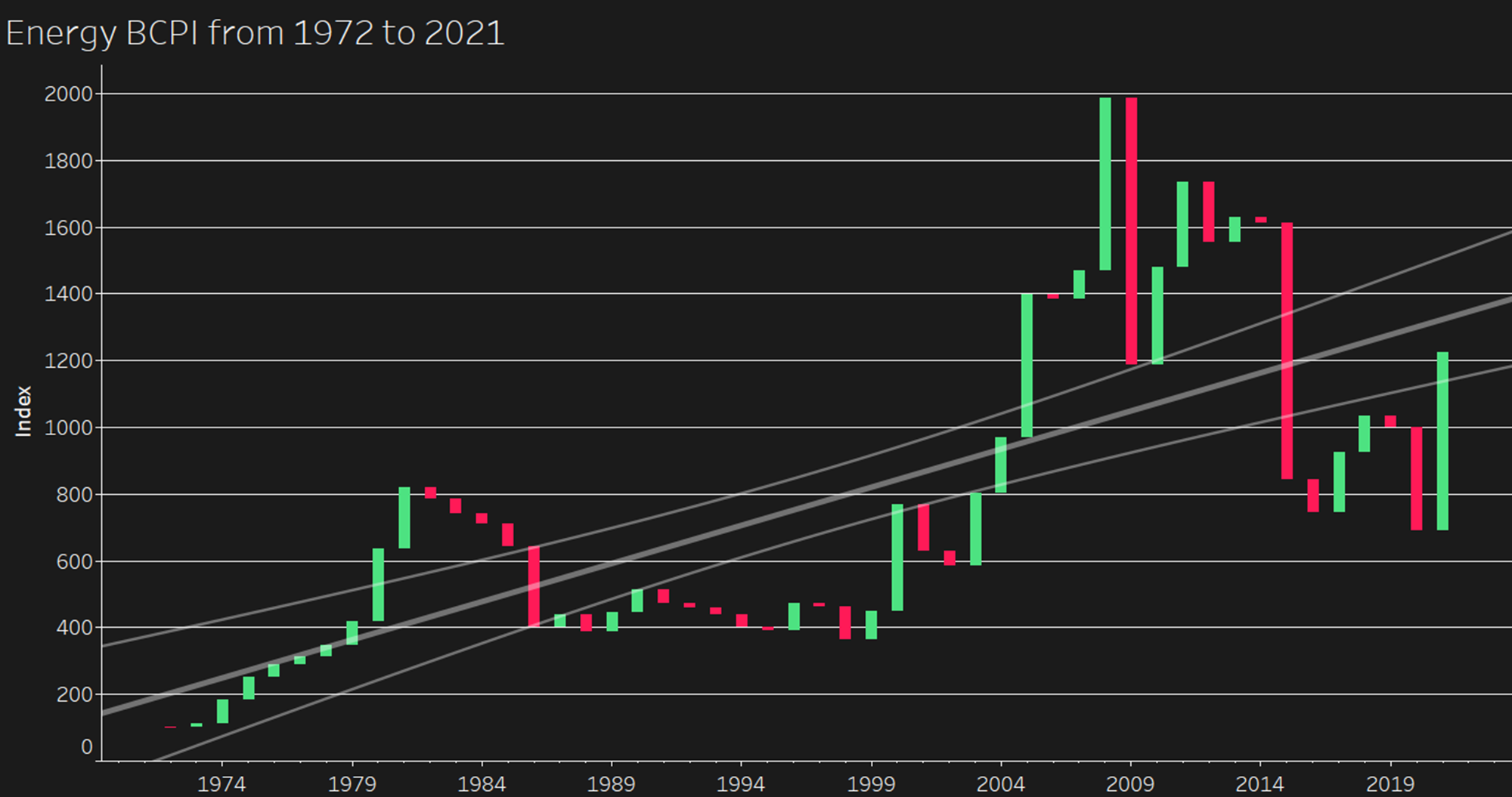 To highlight trend, a linear trend line with 95% confidence interval is added.
To showcase the variation each year, box plot would be a good option. Each dot represents the value of a month in a year.
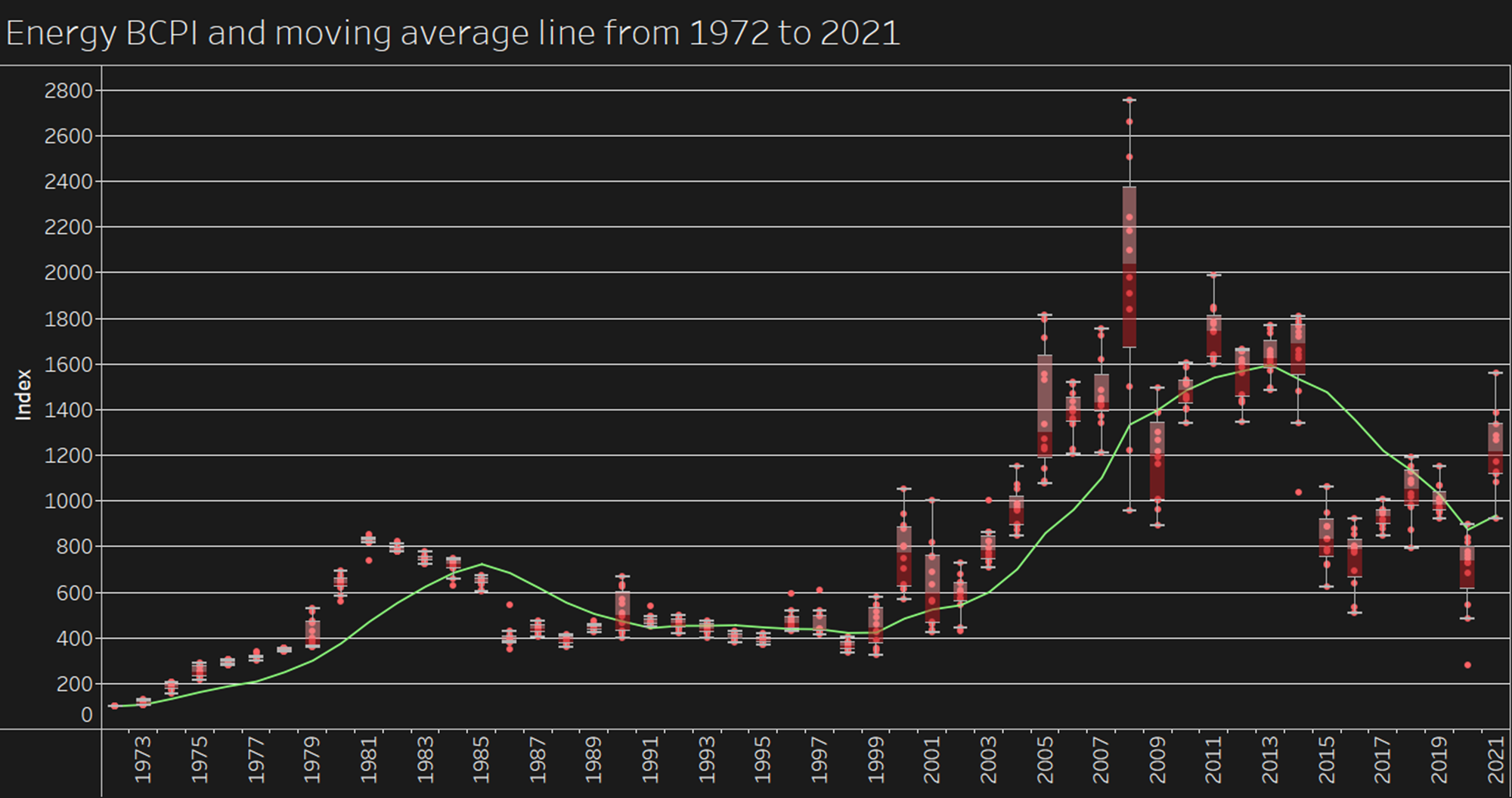 Moving average can be used to better illustrate the long-term trends as it smooths out short-term fluctuation. The line is calculated with data from the previous 5 years.
A dashboard is also created to show the trends of individual components of the BCPI.
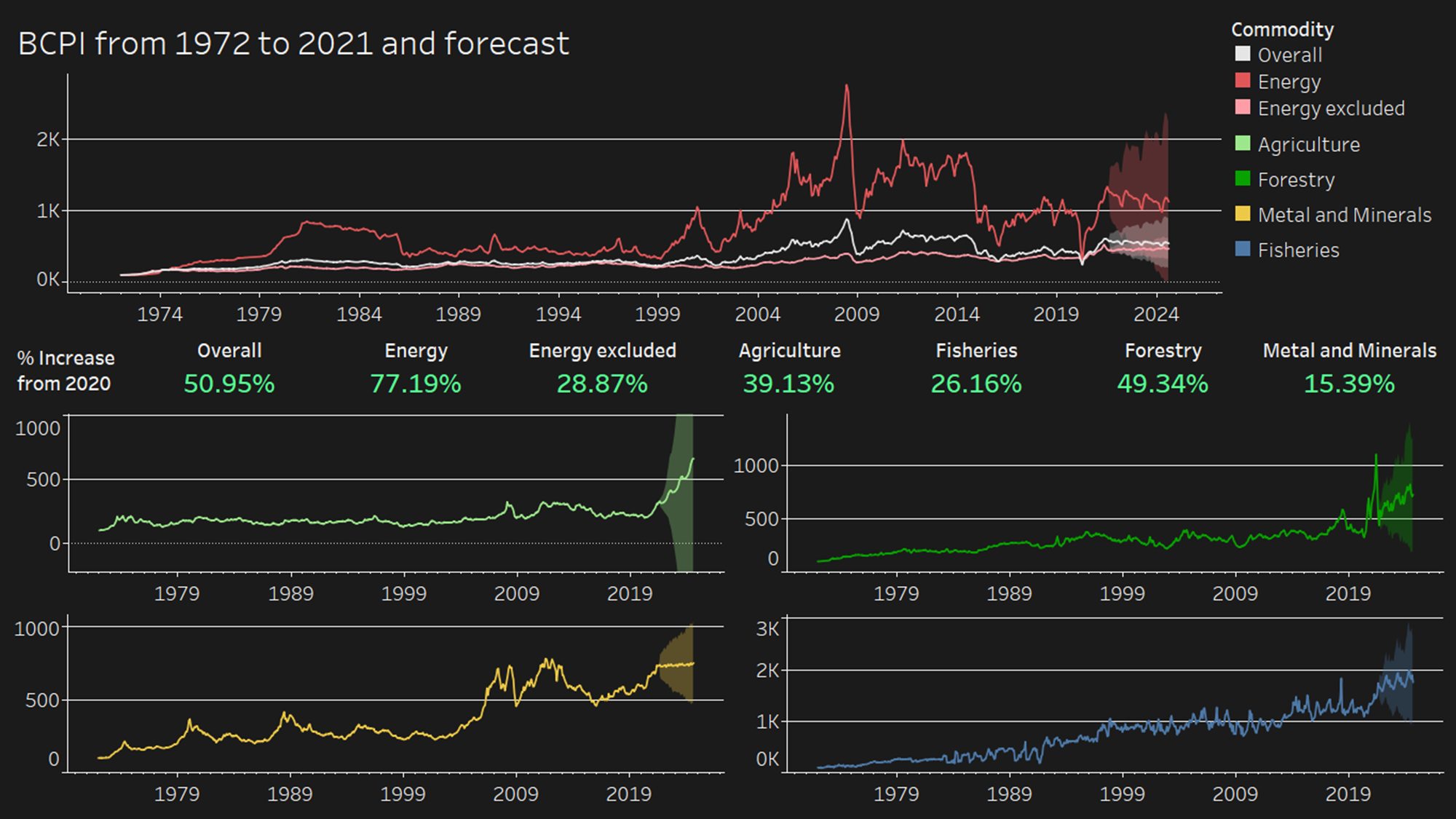 Their trends look quite different from each other.